

The Hidden Logic: Why ‘Balance’ Feels Familiar
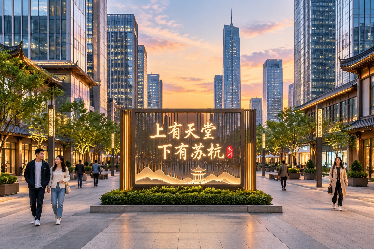
If you walk through a modern Chinese city, you might notice something subtle but pervasive. Unlike the organic, winding streets of many European historic centers or the grid-obsessed precision of American suburbs, Chinese urban spaces often feel deliberately balanced. Buildings face each other across wide avenues. Entrances are centered. Even the layout of new residential compounds (known as xiaoqu) follows a strict axis.
To a Western observer, this symmetry can seem rigid. But for someone raised in China, it feels natural. Why? Because this spatial order is deeply rooted in Hanzi (Chinese characters). Hanzi is not just a writing system; it is a visual art form built on principles of balance, proportion, and structural harmony. The way a character like ‘中’ (zhong, meaning ‘center’) or ‘国’ (guo, meaning ‘country’) occupies space—their left-right and top-bottom symmetry—creates a subconscious template for what looks “right” in our environment.
This isn’t ancient history. It’s a living aesthetic logic that continues to guide how we build our homes, navigate our transit hubs, and even design the apps on our phones.
From Calligraphy to Concrete: Real-World Examples
The Microcosm of the Xiuqu
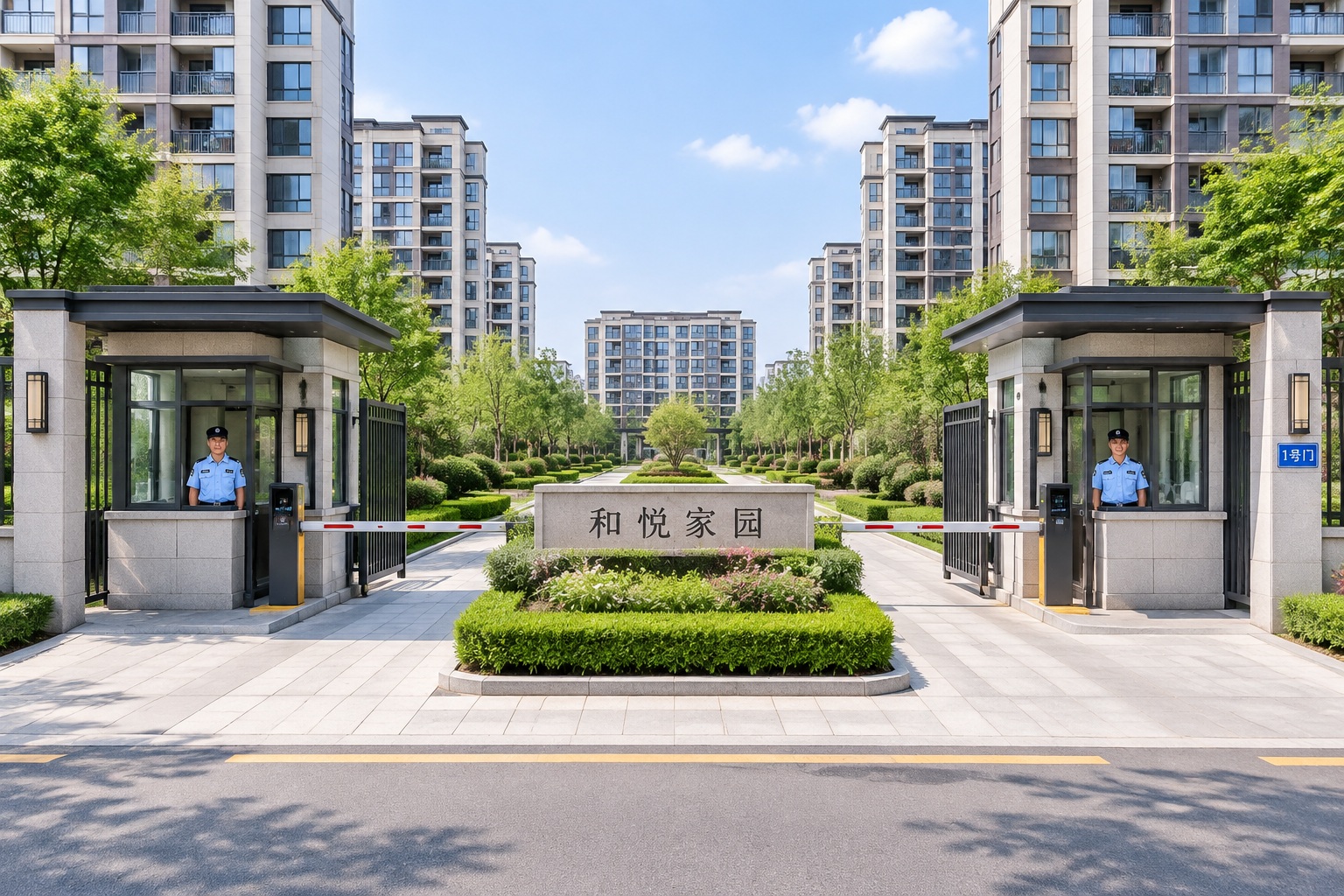
Take the typical modern residential compound. In many Western countries, housing developments might sprawl outward based on topography or profit margins. In China, you will often find a symmetrical layout. The main gate is centered, flanked by identical security booths. The central garden is an axis around which apartment blocks are mirrored.
Consider the character ‘门’ (men, meaning ‘gate’). Its structure is open yet bounded. This visual concept translates directly into the xiaoqu experience: a clear boundary, a centered entry point, and an internal order that feels secure and predictable. For families raising children, this symmetry offers a sense of stability. You know where the playground is, where the shops are, and how to get home. The architecture mirrors the cognitive ease of reading a well-structured character.
Wayfinding in High-Speed Rail Stations
Now, step into a major high-speed rail station in China. These are not just transit points; they are cathedrals of movement. Look at the signage. While English and Chinese coexist, the Chinese characters are often treated as primary visual anchors.
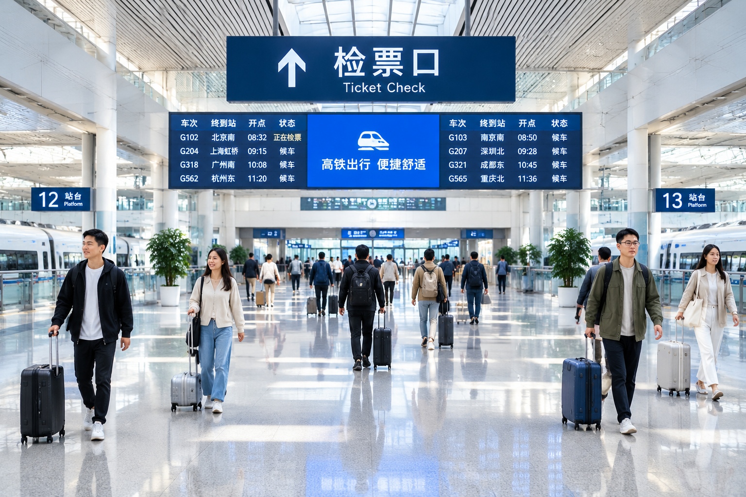
The design principles here echo calligraphy. Characters are spaced to allow for “breathing room” (negative space), and important directional words are centered or aligned to create a clear hierarchy. This isn’t arbitrary decoration. It reduces cognitive load. In a crowded station, symmetry helps the eye find information quickly. The architectural layout of the station—often a vast, central hall with symmetrical wings for platforms—mirrors the balanced structure of complex characters like ‘体’ (ti, meaning ‘body’) or ‘整’ (zheng, meaning ‘whole’). The space feels organized because it follows the same visual grammar that governs our written language.
The Human Experience: Order vs. Chaos
For ordinary people, this symmetry is less about art history and more about comfort. In a rapidly changing society where the skyline of cities can transform in a decade, symmetrical spaces provide a psychological anchor. They offer predictability.
Compare this to some Western architectural trends that prioritize asymmetry as a sign of “organic” growth or artistic rebellion. While those styles have their place, the Chinese preference for symmetry is pragmatic. It reflects a cultural value placed on harmony (he, 和) and collective order. When you enter a government building, a university campus, or even a large supermarket in China, the central axis guides your movement. It’s a non-verbal instruction: “Stay centered, stay orderly.”
This doesn’t mean Chinese architecture lacks creativity. Far from it. But the creativity operates within a framework of balance. Just as a calligrapher finds infinite expression within the strict boundaries of a character’s stroke order, Chinese architects find variety within symmetry—using different materials, lighting, and textures to break monotony while maintaining the core structural harmony.
Modern Evolution: Tradition Meets Innovation
You might wonder if this is all stuck in the past. The reality is that young Chinese architects are actively reinterpreting these principles for the 21st century.
In sustainable urban planning, the “central axis” is being used to optimize sunlight and wind flow. In smart city designs, the symmetry of Hanzi is influencing digital interfaces. Look at popular apps like WeChat or Alipay. The iconography and layout often favor bilateral symmetry or balanced grid systems. This is not a coincidence. It’s an extension of the same aesthetic sensibility that guides physical space.

Furthermore, modern landmarks are moving beyond literal replication of ancient palaces. Architects like Ma Yansong of MAD Architects blend Hanzi-inspired fluidity with futuristic forms. They might take the concept of “balance” and reinterpret it as a dynamic equilibrium between nature and technology, rather than just left-right mirror images. But the underlying desire for visual harmony remains unchanged.
A Living Language of Space
So, the next time you walk through a Chinese city, look up from your phone. Notice how the buildings frame the sky in balanced pairs. Notice how the signs guide your eyes with clear, centered logic.
Hanzi is more than a tool for communication. It is a lens through which Chinese people perceive space. The symmetry of Chinese architecture is not a relic of the imperial past; it is a modern manifestation of a cultural habit of mind—one that values order, balance, and clarity in an increasingly complex world. Understanding this helps us see that China’s urban landscape is not just concrete and steel, but a living, breathing extension of its language.
Start the discussion at forum.chinacomes.com